Insights: Understanding refugee distributions among Germany
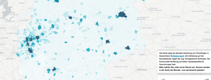
Erftstadt/Germany, 22nd of December 2015 – Motivated by the refugee crisis in Europe we present a visualization for the distribution of arriving refugees. With our online tool a visualization of the current situation given by the Federal Office for Migration and Refugees are easily understandable on a municipal level.
Our motivation for such an online tool, which our trainee Leon Waanders kindly crafted, were the current news and dozens of talks with officials among German federal offices. Often questions arose like: “How many slots do we have to prepare if a registration of x refugees at the border had happened?” or “What does the current flow of refugees into the country mean for our municipality in the near future?” – Plenty of questions whose answers are given by individual federal laws and acts.
Our online tool visualizes the first month at start-up. By choosing a month in the time series below the map, a distribution for the actual value can be derived. The map visualizes the geographic distribution among the municipalities. Considering a prognosis for the forthcoming month, a slider (dashed line in the blue area) can be moved along the y-axis to simulated the distribution.
The tool was built using CartoDB and tools like PostGIS 2.0 and PostgreSQL. Provided data was provided as open government data with attribution. Processing took place within CartoDB, whereby interaction was implemented using a combination of d3.js, plottable.js and CartoDB.js as the data-binding API. This tool serves as a proof-of-concept. Documentation and usage of the different modules was handy and easy to understand. However, the current implementations of plottable and CartoDB.js tend to be one-size-fits-all downloads resulting in a page download above 1MB. Here a stronger modularization could be worthy – thanks to Andrew Hill for listening and continuous improvements;-).


